Help young professionals save for a property purchase
The aim of this exercise was to create a mobile application to help young couples set up a savings plan with a view to investing in their principal residence.
The various discussions I had with potential users confirmed their interest in this application, which they saw as a "super application" that would help them manage their money on a day-to-day basis, but also help them realize large-scale projects, such as a property purchase, a major trip, an important life event...
To realize this project, here are the different stages of the design process I went through:

First, I carried out some initial hypotheses, before conducting 5 remote interviews, each lasting 30 minutes.
These interviews enabled me to collect quantitative data on how potential users' finances were managed.
The aim of these interviews was twofold:
- to define a persona
- to understand the users' needs in order to transform them into features.
So here's Jade, a young working woman who wants to invest in her principal residence with her partner Marc in the near future:

3 needs were identified in these interviews:
The competitor study was conducted around the needs identified above.

Following the interviews, I was able to define a list of features expected by users, and define their importance. Thus, the main features for the MVP of this application will be as follows:
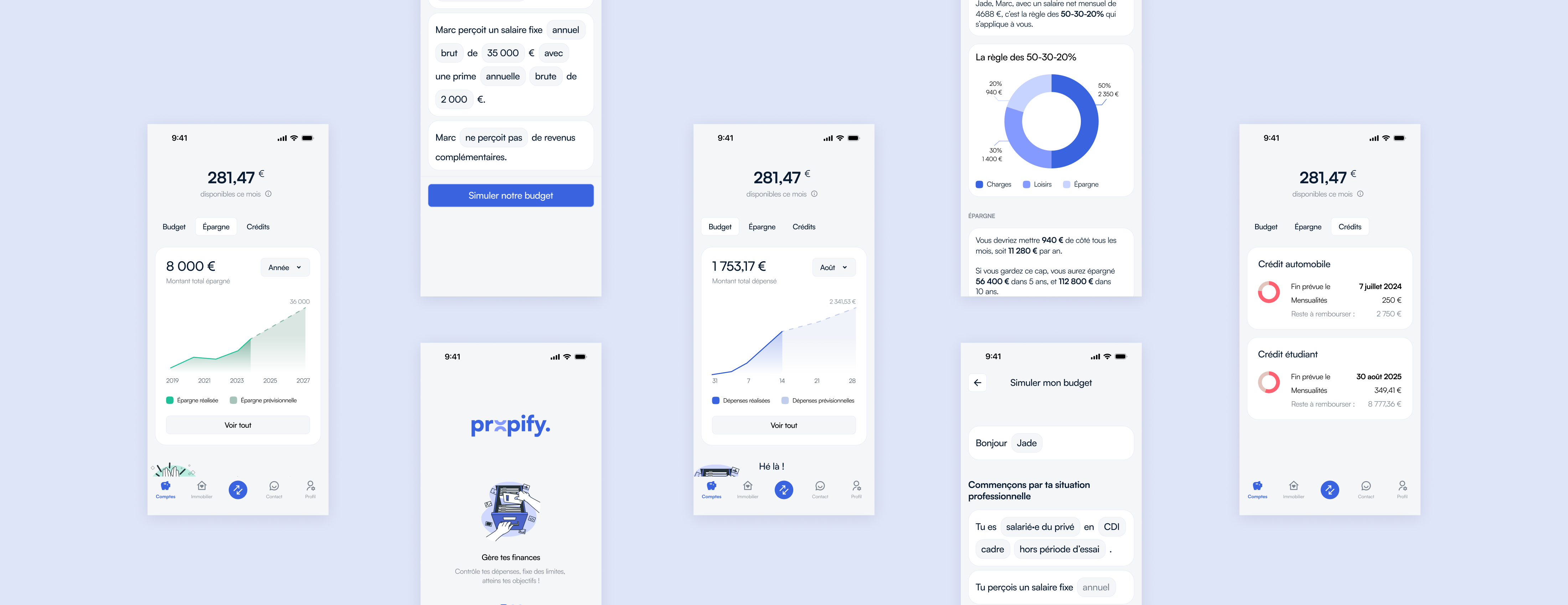
For this exercise, I focused on one flow: the simulation of a monthly household budget.
This flow takes place when the application is opened for the first time. The couple answers a series of questions about their financial situation, and an ideal budget is suggested.
Following this advice, the couple can link the application to their bank accounts, in order to analyze their actual spending and receive advice on how to better allocate their spending and boost their savings.
In this way, users are given a preview of the application, which encourages them to create an account.
This advice phase only takes place when the application is used for the first time; after that, users will be able to track their spending and savings on a daily basis. Of course, they can also adjust their spending and saving as required.

The visual choices I've made are designed to win users' trust:
- The color blue is associated with reliability, truth and tranquility. It is perfect for assuring the user of the seriousness of this application, which deals with the serious subject of money.
- The family font, Satoshi, is a classic, serious font that brings a certain originality and modernity to the application.
- The monochrome illustrations are used in tandem with the few messages displayed in the application. The 2D, reminiscent of 90s-2000s cartoons, is designed to make users nostalgic. It brings a touch of fun to the application, helping to create a bond with the user.

As we saw earlier, tone & voice will play a key role in building trust with users. Plus, gamification will be introduced by encouraging messages.
I conducted usability tests with 4 face-to-face testers, each lasting 1 hour.
The objectives of this test:
- Check that users understand how the questionnaire works
- Check that the information provided in the "Accounts" tab is what users expect and understand.
With the help of the blocking and annoying feedback, I was able to revise certain elements of the prototype in order to correctly meet user expectations. As I didn't perceive any blocking points on the Accounts tab, most of the significant feedback was provided on the budget simulation flow.

Access the prototypes (in french):
If I'd had more time, I'd have taken all the feedback into account, especially on the "Account" page.
I would also have worked on the "Real Estate" and "Contact" pages.
Obviously, each page needs to be tested with users, reviewed with designers, PMs and developers.
Finally, the KPIs to be tracked must be defined, monitored and analyzed, so that any necessary measures can be taken.
